How “Siguran: Second Age of Gloom” was made.
Pt. 1 – where I discussed the origins of the core mechanic – Gloom – came to be, and the reasons why I decided to take on designing a full set – can be found here.
FOUNDATION
I’ve got a core mechanic, I’ve got the start of the worldbuilding and creative, and I’ve got an enthusiastic group of players who are available regularly to play whatever I make. What now?
Now I have to map out the set. Decide what’s needed in each colour, at each rarity. I’ll admit that the approach I chose to do this for Siguran did not work, but I’ve never done a project quite like this before, so there were always going to be development problems.
I decided to make the set mono-colour dominant, with multicolour only showing up from uncommon upwards. Each colour – and colour combination, but not artifacts – would get equal representation at each rarity except for mythic. This decision was made largely to support pack collation.
The numbers were initially smaller, but final counts are as follows;
- 69 unique commons (13 per each mono-colour, 4 colourless).
- 80 unique uncommons (11 per each mono-colour, 2 per each colour pair, 3 colourless, 2 lands).
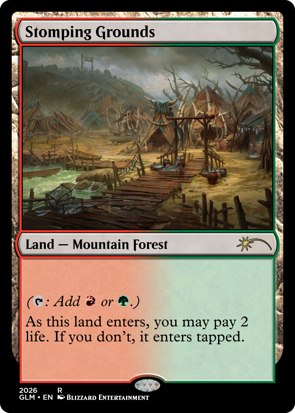
- 37 unique rares (5 per each mono-colour, 1 per each colour pair, 2 colourless, 5 lands).
- 25 unique mythics (3 per each mono-colour, 10 of various colour identities).
- 10 unique common duals (1 per colour combination).
While this looks skewed towards uncommons, so are standard sets made by WotC, for example, Secrets of Strixhaven has 86 commons, 100 uncommons, 60 rares and 20 mythics.
FURNISHING
Now I had a structure to design towards, I could start the real challenge. Coming up with archetypes, and ultimately cards that make the plane of Siguran, still at this point under the codename “Gloomsday”.
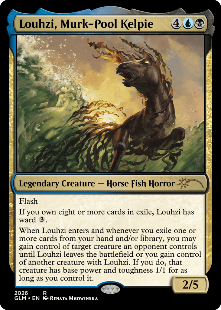
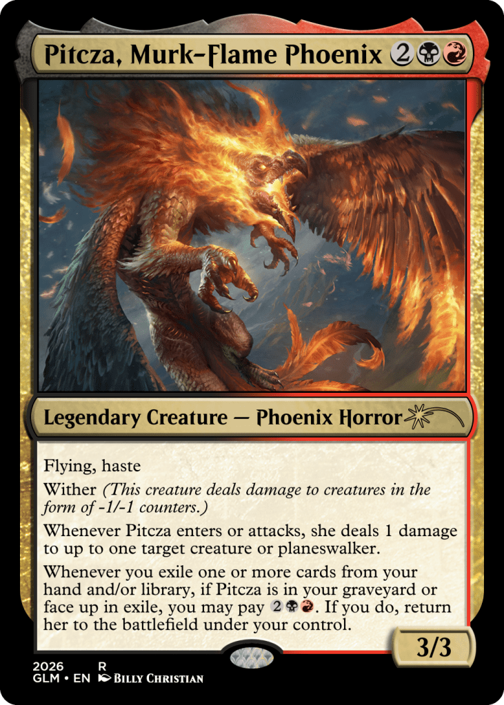
Custom card design biggest hurdle is usually identifying artwork that fits the mechanics and/or flavour you’re going for, but that issue is exacerbated when you’re trying to maintain a somewhat consistent worldbuilding.
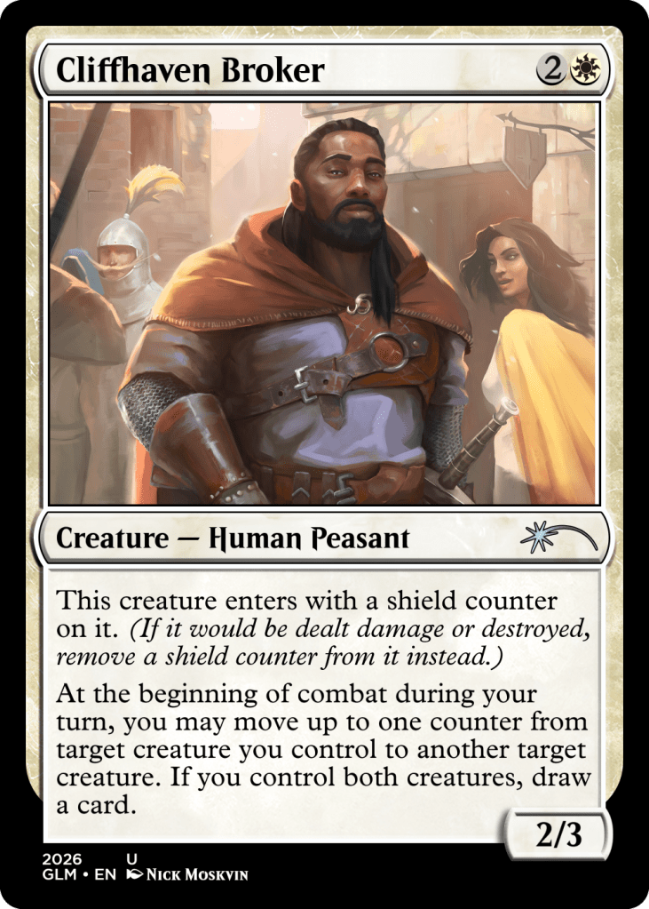
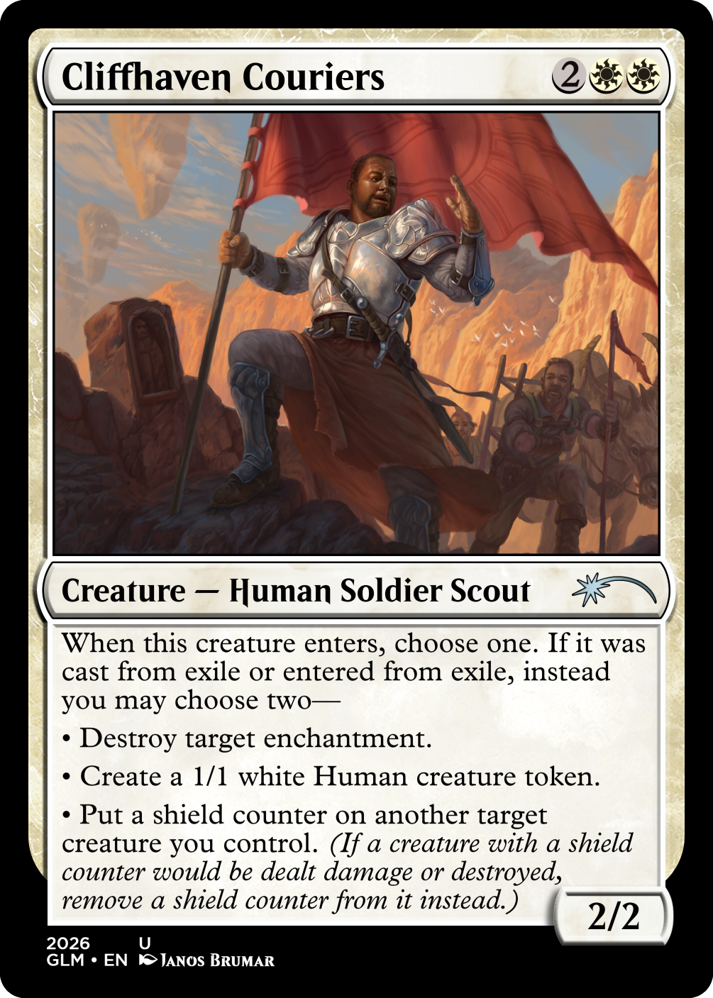
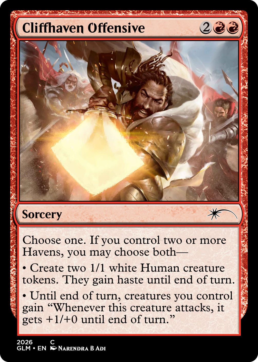
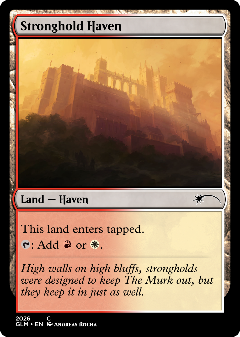
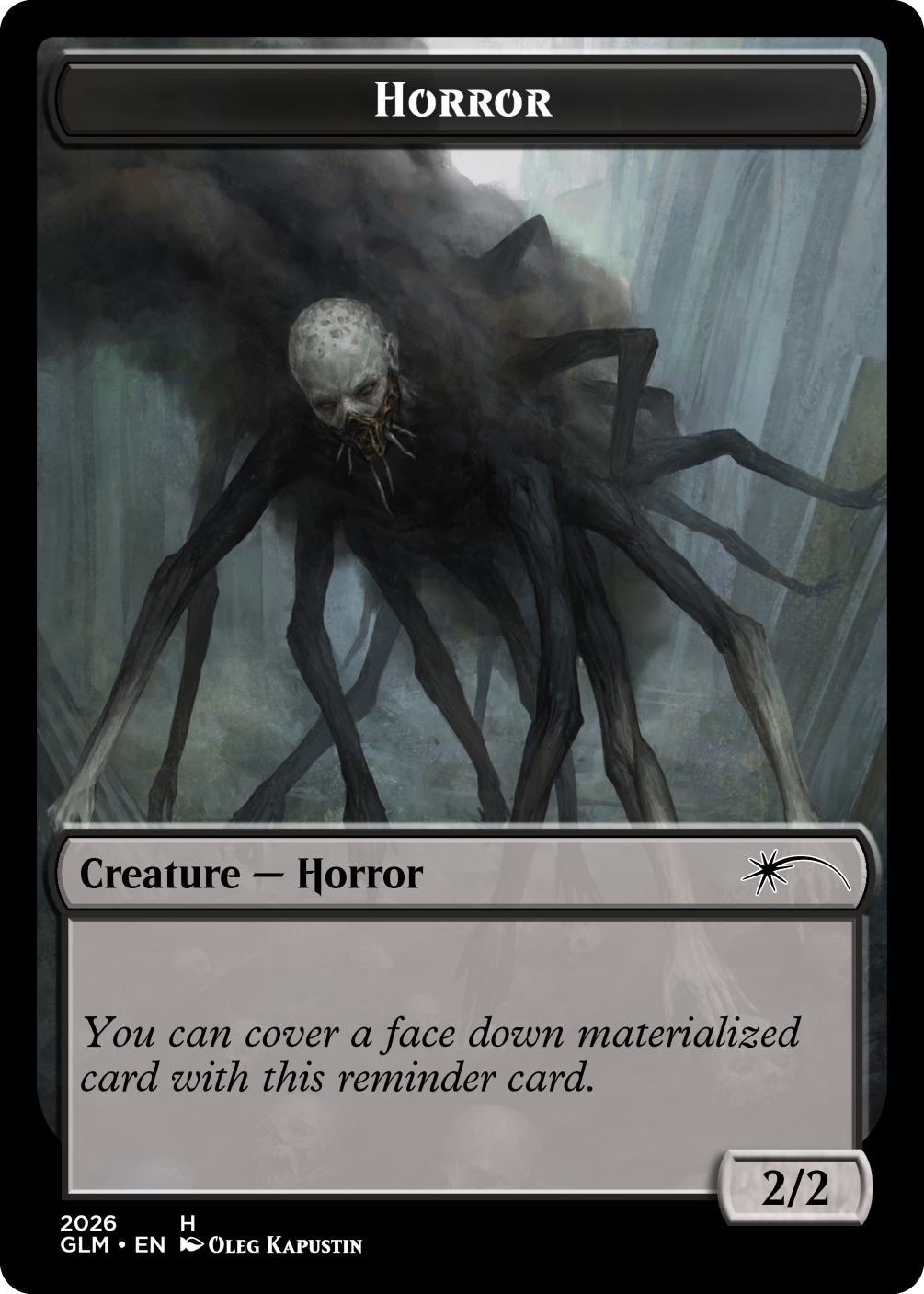
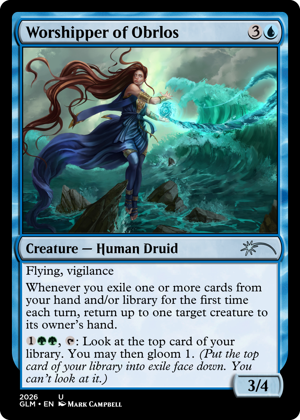
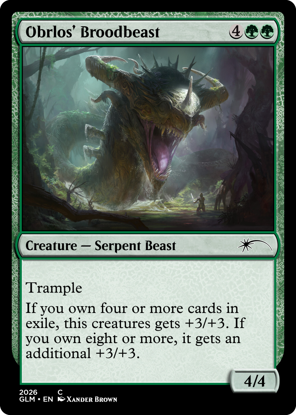
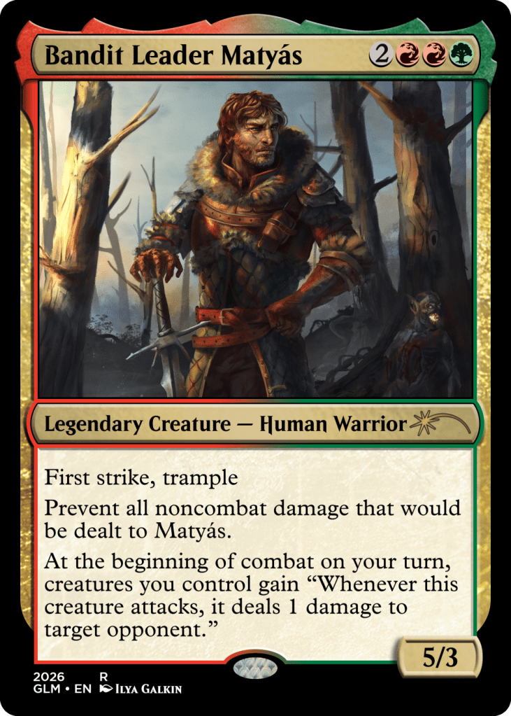
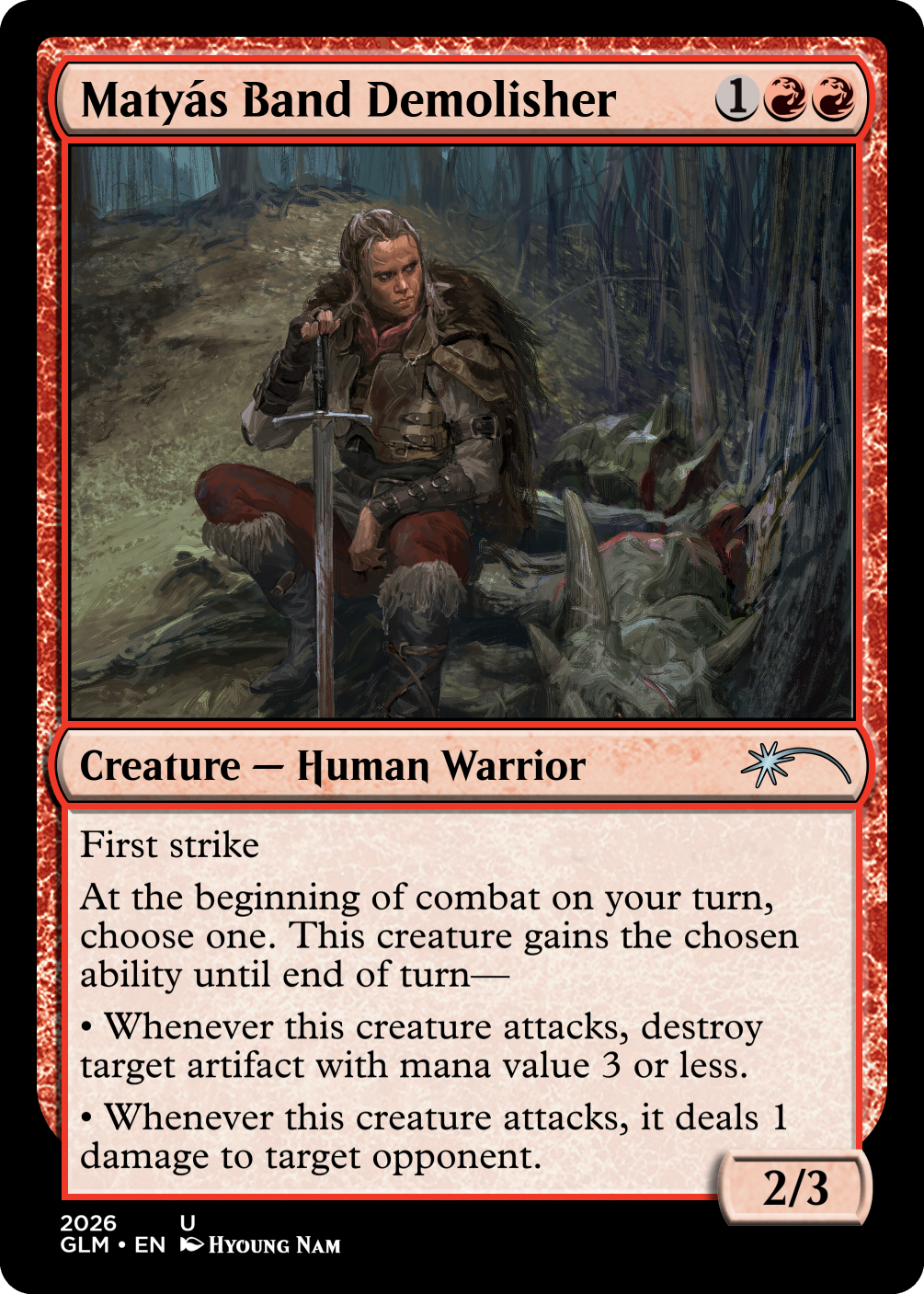
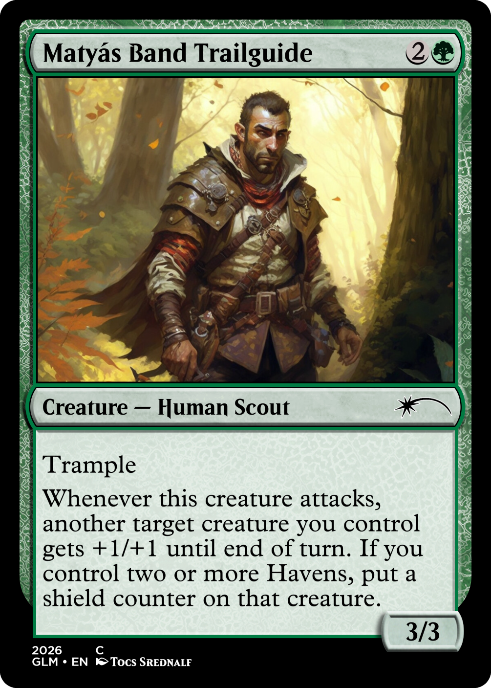
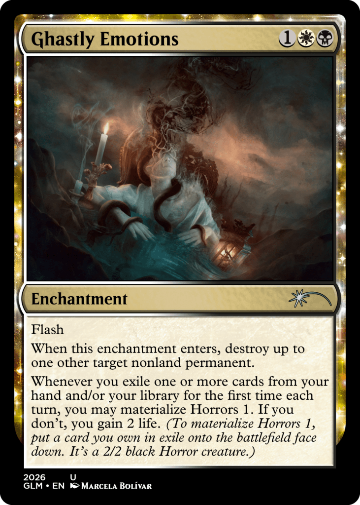
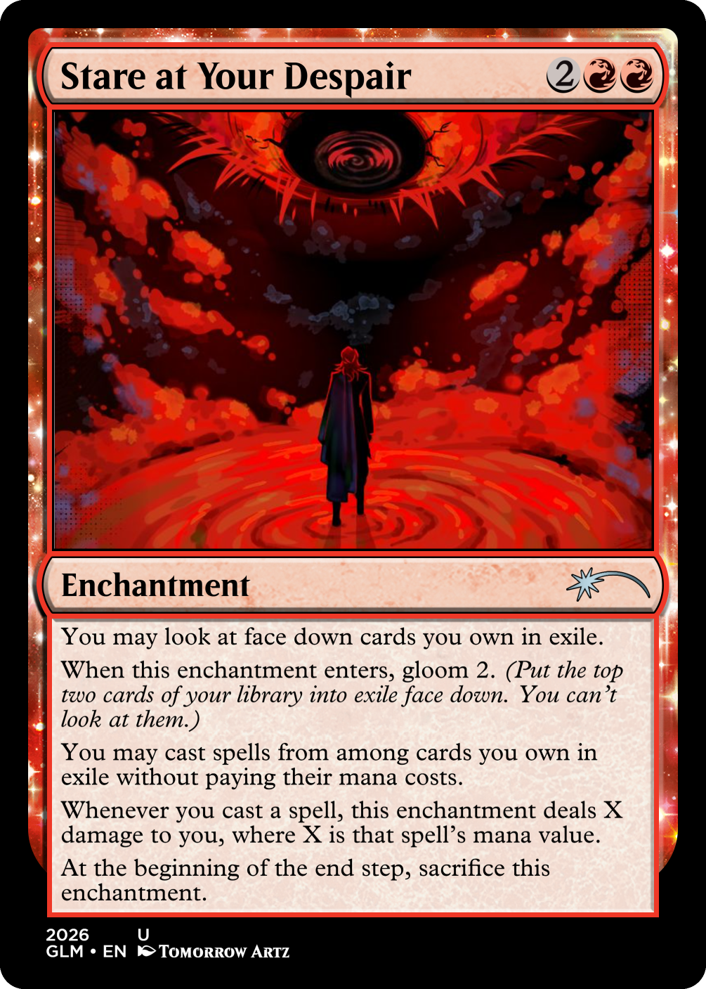
As such, a significant number of cards, and in some cases archetypes are were designed around the artwork I was finding. Gloom was attached to a vague spreading evil I named The Murk, and the horrors could take almost any form. Humans are another dominant card type, and the disparate clothing and locations were explained through a sparsely populated plane.
I’m very proud of the overall visual identity I was able to put together.
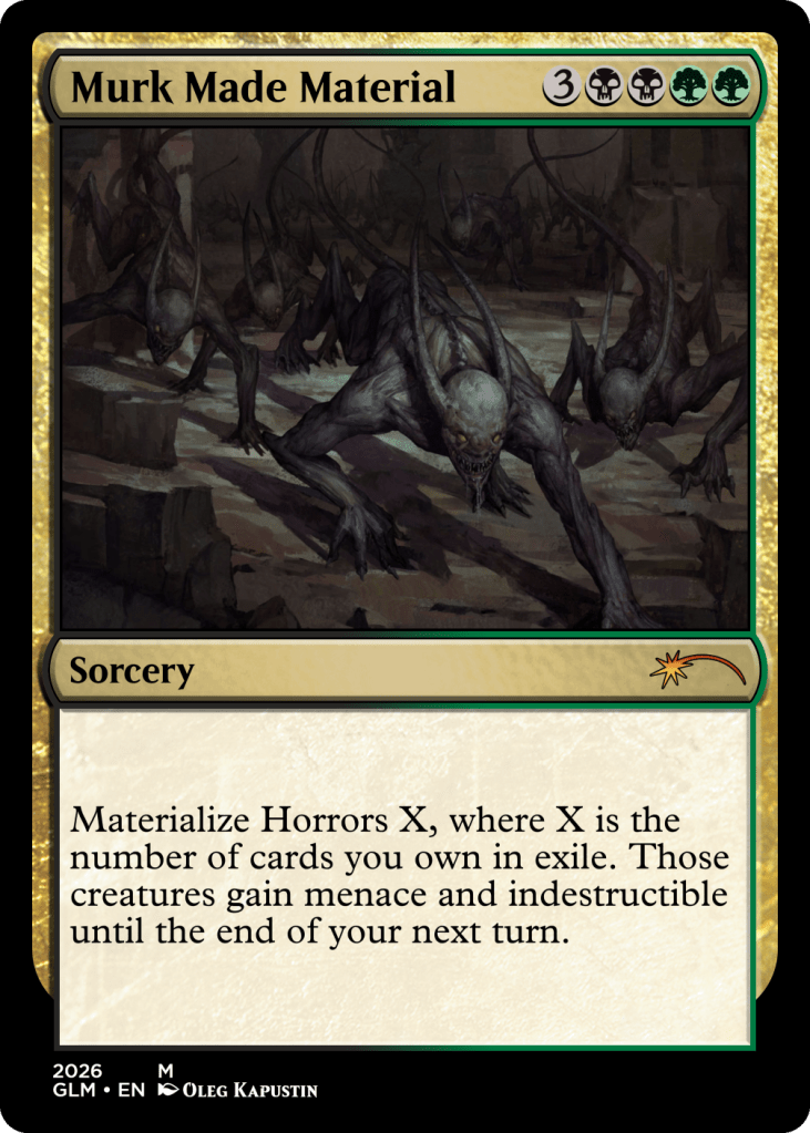
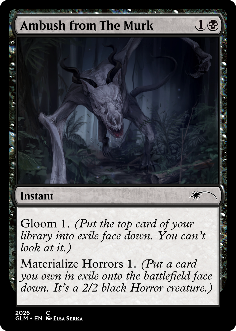
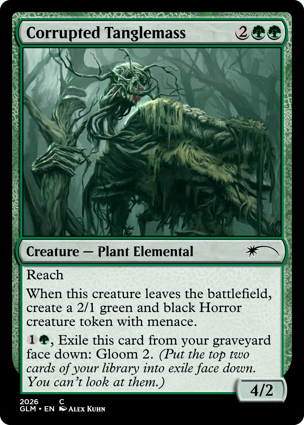
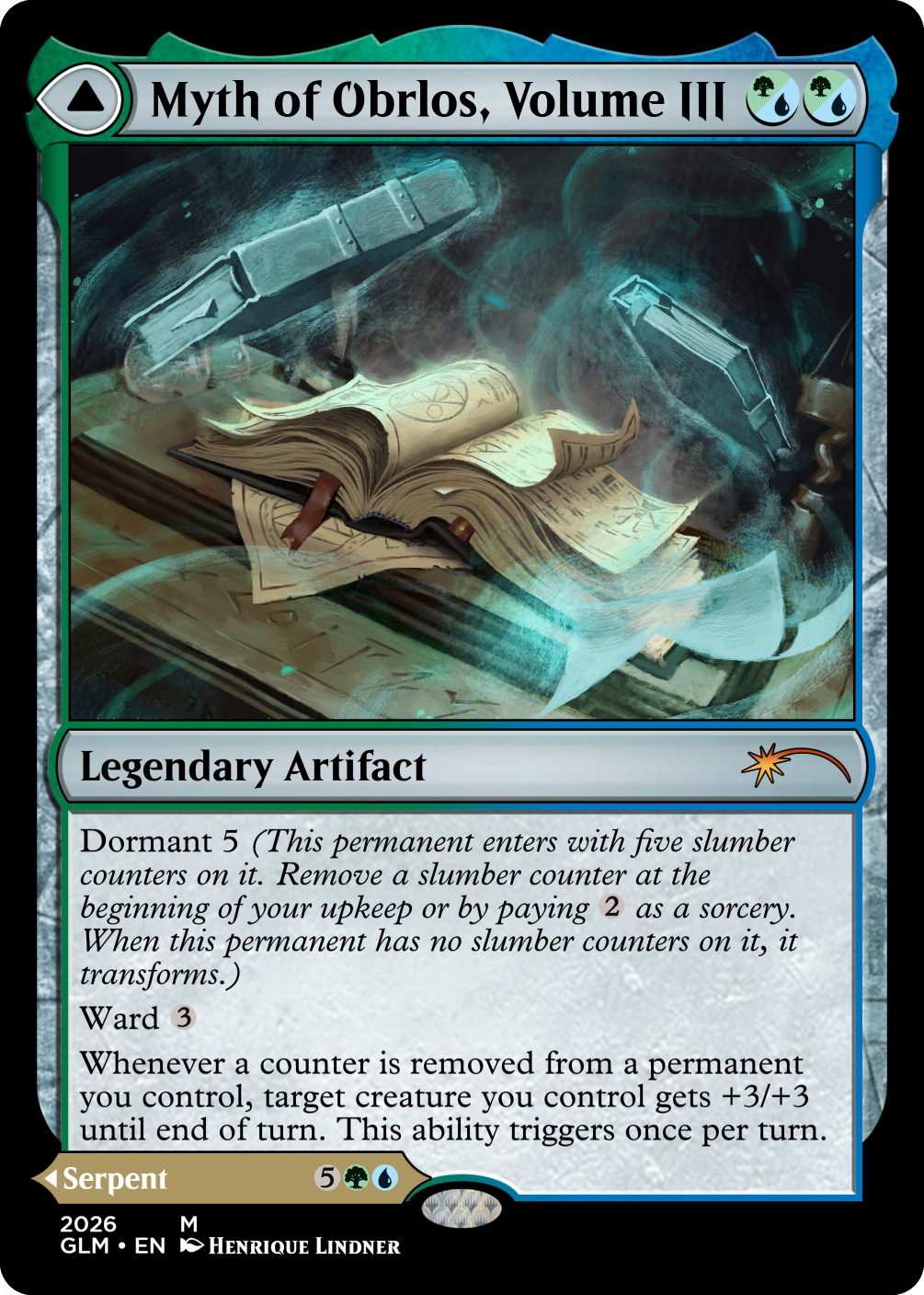
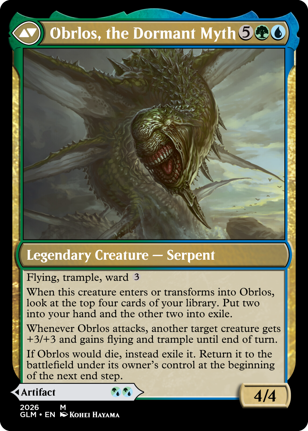

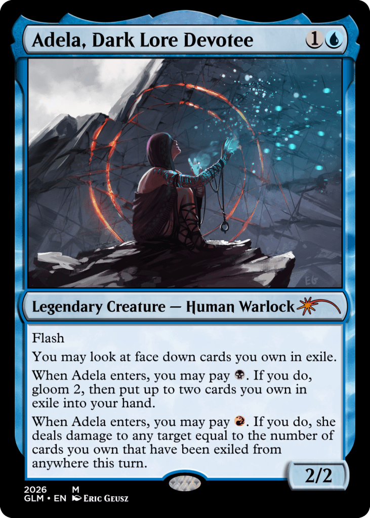
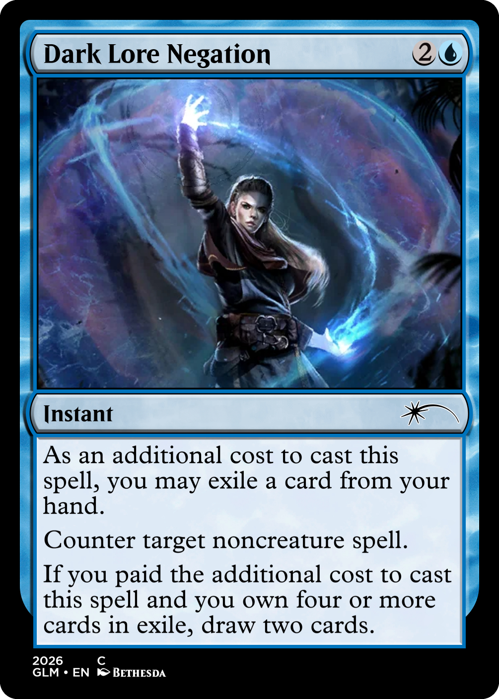
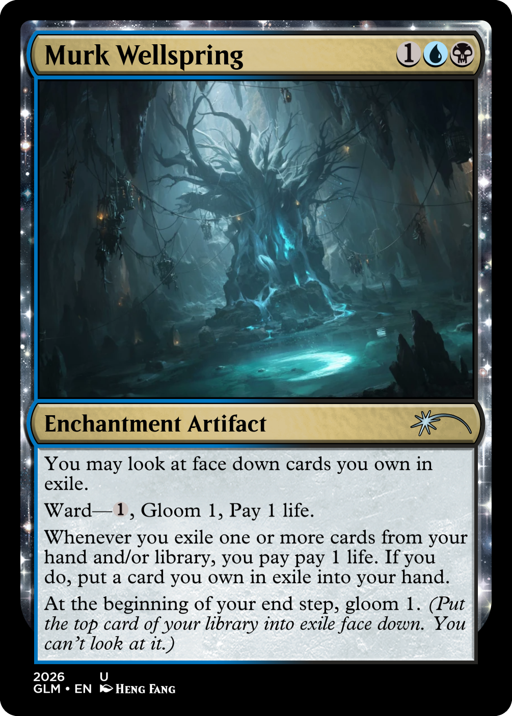
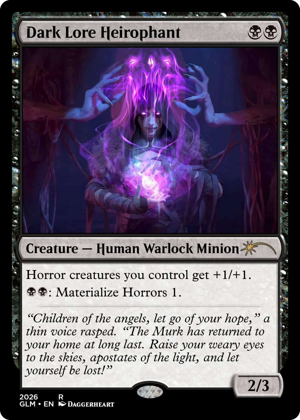
As a result of determining mechanic identity from the visual identity, many cards and themes went through several changes – especially when I identified a piece that I preferred to what I already had.
It’s a fun challenge, to justify a card’s text box based on the visual identity – if you’re making half a dozen of them, not over 200! I’m glad I persisted though, I like Sigurdan looks way better for that effort, and some of my favourite cards were born precisely from this process.
FINISH
Don’t worry, we’re getting close to discussing the mechanics and archetypes, it’s just that those – barring Gloom – came later into the design process for this set than what we’ve just discussed.
I’m trying to give you a timeline – to the best of my memory – of this process, so you know not to do it this way round if you ever try something like this yourself!
I’ve learned a lot from how I approached making this set, and very little of what I did here is being used on my second set. This was a challenge of a project.
A fun challenge, but a challenge nonetheless.
Thanks for reading
Dingus Egg
This is part two of how I created my custom set, “Siguran: Second Age of Gloom”. In the next part, I’ll go through the mechanics of the set. The full set list can be found here.

Leave a comment